Overview
Teaching: 15 min Exercises: 0 minQuestions
How do I see my {shapefile/KML/GPX/GeoJSON} file on a map?
How do I control the styles and other parameters of a Cartopy plot?
Objectives
Review loading geospatial data using Geopandas.
Review setting up
cartopyaxes.Use
ax.add_functions to add shapes to cartopy plot.
The moment you’ve likely been waiting for: plotting your data on a map using cartopy. Most of this episode will be live-coding. Fundamentals and broadly-defined steps are below.
Plotting Your Own (vector) Data
1. Load It.
It’s likely that your geospatial information will be loaded into Python using a library like Geopandas or similar. The only requirement that cartopy has for plotting spatial (vector) data is that it’s loaded into a Shapely geometry class (e.g. shapely.geometry.Polygon or shapely.geometry.Point — these were covered in the GeoHackWeek Vector tutorial, so we won’t go into detail here).
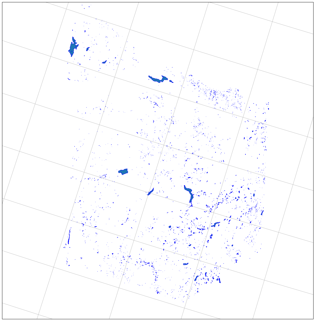
For this example we’ll be using a shapefile of lakes on Washington’s Olympic Peninsula from the National Hydrography Dataset (sourced from the NHD_Waterbody data).
lakes = geopandas.read_file("oly-lakes.shp")
(If you’re playing along at home, you can find these data here)
CRS
It’s important that you know the coordinate reference system (CRS) that your data is projected in. Many times, data loaded from shapefiles (or other vector formats) have their CRS embedded; loading these data using geopandas will make the CRS available in the
.crsattribute of theGeoDataFrame(e.g.data.crs). Geopandas expresses CRSs as EPSG codes.
2. Decide on Map Projection + Create Axes
As in the previous episode we need to establish the projection of our map. This is irrespective of the coordinate reference system of the data; this is part of the beauty of cartopy: data and visualization are separate, and cartopy handles the necessary cartographic conversion.
For our example we’ll use the Lambert Conformal projection:
ax = plt.axes(projection = ccrs.LambertConformal()))
Under The Hood
What’s happening here, really? When you add the
projectionkeyword argument to the genericplt.axesfunction, you’re instructingmatplotlib(viacartopy) to, instead of creating a regularAxesSubplotobject to plot data on, create aGeoAxesSubplotobject. This special set of axes is projection-aware, and is responsible for the necessary transformation of data from source projection to the specified axes projection.
3. Plot Data
This is the interesting part. Here the steps are varied depending on what kind of data is being plotted. Cartopy contains several helper functions for plotting different kinds of data, and they all are attributes of the GeoAxes object. Each of the “adder” functions begins with add_. (functions reference)
Since we’re working with vector data here, we’ll be using ax.add_geometries. This function takes two arguments: an iterable (list, iterator, etc.) of Shapely geometries, and the coordinate reference system of these data. Conveniently, geopandas gives us an interable of geometries directly, via the geometry column of any GeoDataFrame.
For our example, we can therefore write:
ax.add_geometries(lakes.geometry, crs = ccrs.PlateCarree(),
                  edgecolor='blue', zorder = 5) # for Lat/Lon data.
(The arguments edgecolor and zorder affect how the data are displayed. edgecolor changes the color of the edges of the displayed polygons, and zorder specifies that the polygons are rendered above other plotted polygons. )
We also want to make sure we can actually see the data. To do this, we can set the extent of the map from the boundaries of the whole GeoDataFrame using total_bounds.
bounds = lakes.total_bounds
ax.set_extent([bounds[0], bounds[2], bounds[1], bounds[3]])
All together the code looks like this:
bounds = lakes.total_bounds
ax = plt.axes(projection = ccrs.LambertConformal())
ax.set_extent([bounds[0], bounds[2], bounds[1], bounds[3]])
ax.add_geometries(lakes.geometry, crs = ccrs.PlateCarree(),
                  edgecolor='blue', zorder = 5)
|
4. Add Context
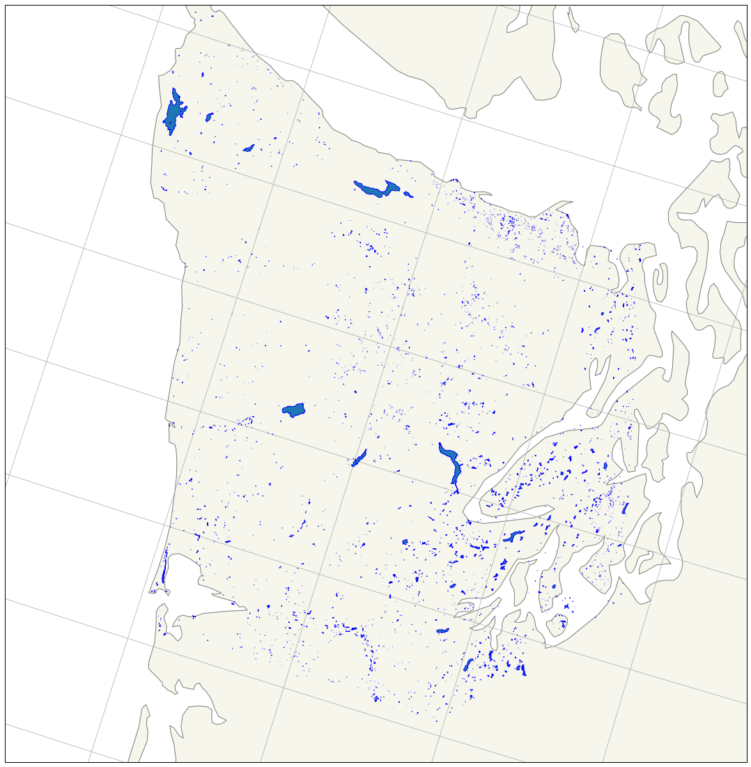
Maybe we’d like to add some borders, describing where the continent boundaries are. This is where the built-in features of Cartopy can help us. We can use cartopy.feature.NaturalEarthFeature to download useful features from the Natural Earth dataset.
land = cf.NaturalEarthFeature(
  category='physical',
  name='land',
  scale='10m',
  facecolor=cf.COLORS['land'],
  edgecolor='black',
  alpha=0.5)
This downloads the land dataset at 10m scale (from the physical collection in Natural Earth), colors the polygons using a standard “land” color, and sets the opacity to 0.5. The options for category, name, and scale are often difficult to decipher. If you travel to the Natural Earth dataset of your choice (e.g. 50m-scale countries: https://www.naturalearthdata.com/downloads/50m-cultural-vectors/50m-admin-0-countries-2/) and use your browser to copy the link within the “Download Countries” button (https://www.naturalearthdata.com/http//www.naturalearthdata.com/download/50m/cultural/ne_50m_admin_0_countries.zip), you can usually find what you’re looking for. In this case: category = cultural, name = admin_0_countries, and scale = 50m.
To add the above land to the map, all we need to do is the following:
ax.add_feature(land)
Here’s the full code:
bounds= lakes.total_bounds
figure = plt.figure(figsize=(20,20))
ax = plt.axes(projection = ccrs.LambertConformal())

ax.set_extent([bounds[0], bounds[2], bounds[1], bounds[3]])

land = cf.NaturalEarthFeature(
    category='physical',
    name='land',
    scale='10m',
    facecolor=cf.COLORS['land'],
    edgecolor='black',
    alpha=0.5)

ax.add_geometries(lakes.geometry, crs=ccrs.PlateCarree(), zorder=5, edgecolor='blue')

ax.add_feature(land)

ax.gridlines()
|
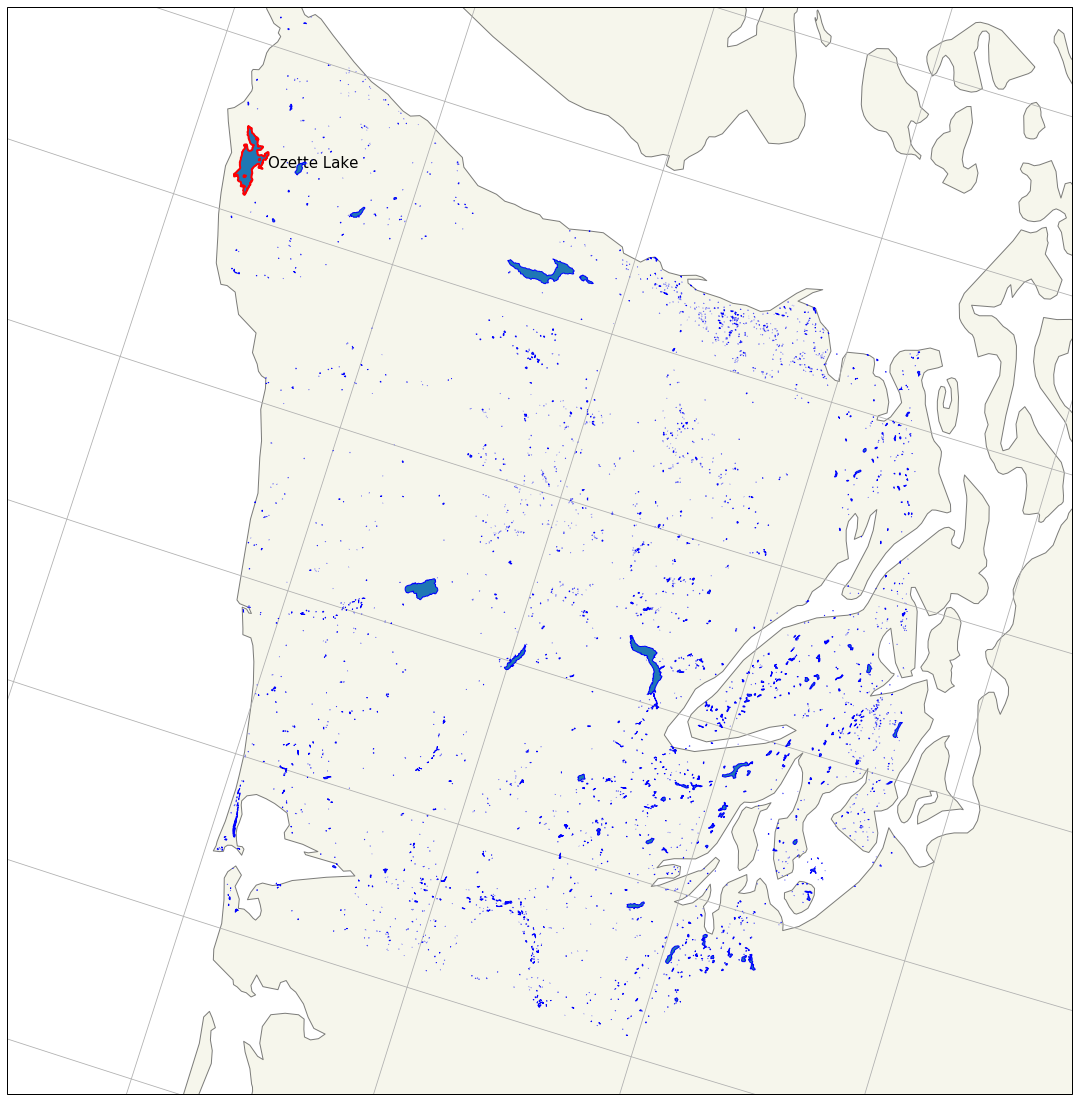
Some “GIS”
Let’s say we want to know, and highlight on the map, the largest lake on the Olympic Peninsula. With Geopandas and Cartopy, it’s simple. First, we sort the data by the “AREASQKM” column (you could also use the lakes.geometry.area function to compute areas for each geometry), and select the top record.
biglake = lakes.sort_values(by="AREASQKM", ascending=False).head(1)
Then, we plot the geometry component of biglake with no fill and a thicker red border, using a larger zorder to ensure the new polygon is on top and visible.
ax.add_geometries(biglake.geometry, crs=ccrs.PlateCarree(), edgecolor = 'red', facecolor = 'none', linewidth = 2, zorder = 20)
We could even place a label on the map via Matplotlib’s text function, using the centroid of the biglake geometry to locate the label (with a 0.05 degree offset for legibility), and the text label from the GNIS_NAME field of the record.
ax.text(biglake.centroid.x + 0.05, biglake.centroid.y, biglake.GNIS_NAME.values[0], transform=ccrs.PlateCarree(), fontsize=15)
All together, the code looks like this:
bounds= lakes.total_bounds
figure = plt.figure(figsize=(20,20))
ax = plt.axes(projection = ccrs.LambertConformal())

ax.set_extent([bounds[0], bounds[2], bounds[1], bounds[3]])

roads = cf.NaturalEarthFeature(
    category='physical',
    name='land',
    scale='10m',
    facecolor=cf.COLORS['land'],
    edgecolor='black',
    alpha=0.5)

ax.add_geometries(lakes.geometry, crs=ccrs.PlateCarree(), zorder=5, edgecolor='blue')


# Label Largest Lake
biglake = lakes.sort_values(by="AREASQKM", ascending=False).head(1)
ax.add_geometries(biglake.geometry, crs=ccrs.PlateCarree(), edgecolor='red', facecolor='none', linewidth=2, zorder =20)
ax.text(biglake.centroid.x + 0.05, biglake.centroid.y, biglake.GNIS_NAME.values[0], transform=ccrs.PlateCarree(), fontsize=15)

ax.add_feature(roads)

ax.gridlines()
|
We can see that we’ve highlighted “Ozette Lake” as the largest lake on the Peninsula.
Important Point: Anything that Matplotlib can do (for the most part) can be plotted on cartopy GeoAxes. Most matplotlib plotting functions (text, contourf, etc), require either a crs argument or a transform argument describing the source projection of the data. Notice how above we gave the coordinates of Mt. Olympus in UTM 10T; cartopy does the conversion to our projected space for us.
Matplotlib and cartopy represent a robust pairing of data visualization tools for creating impressive, customizable static maps. Next we’ll move onto a quick tutorial to create moveable, interactive maps with your own data.
Key Points